Reporting Services 2016 – Back in the game:
the new capabilities & features
It has been years since my last publications and presentations on Reporting Services. This is no surprise, because since the 2008 R2-release nothing has happened there. With SQL Server 2016, the Reporting Services finally get attention again, as I had preannounced in passing already last May („SQL Server 2016 – the Security & Performance Release“). Will it be enough for a revival? You can decide for yourselves. In this article I will introduce what’s new.
Report types
One of the most important innovations is the integration of the DataZen technology. By means of this technology, optimized reports, i.e. “Mobile Reports,” can be developed for mobile devices such as smartphones and tablets. For this purpose, a particular development tool is available, the “Mobile Report Publisher,” which, similar to the Report Builder (in which, aside from the optic, basically nothing has changed, but it performs much better than the old Click-Once application), can store reports locally as well as on the Report Server.
Reporting Services Web Portal
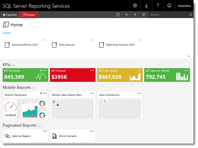
The most obvious innovation in SSRS is the new “Reporting Services Web Portal,” which replaces the old Report Manager and is based on Html5. It now also completely supports Chrome and Firefox and automatically scales to all screen sizes. This is what the new portal looks like:
Here you can see that in addition to folders (above), KPIs and Mobile Reports are separately listed by the now so-called “Paginated Reports” (i.e. page-based reports).
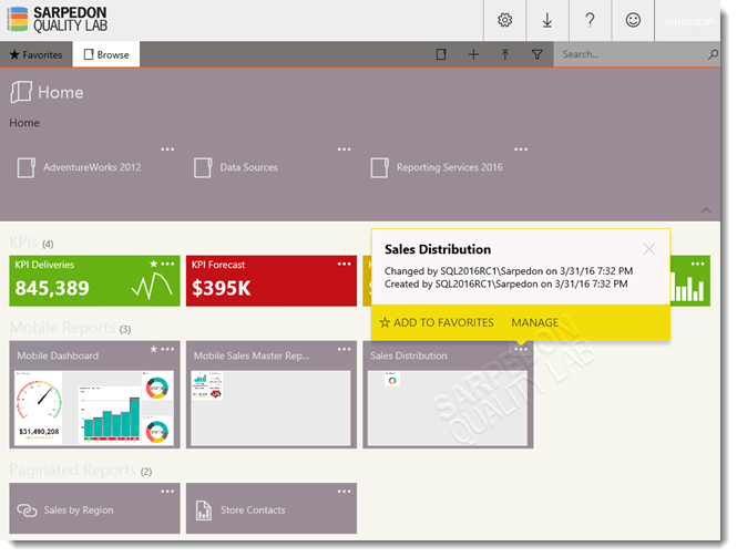
Furthermore, the new portal now also supports the option to slightly adjust the design. This is called Custom Branding.
Technically, it is all based on an xml-file which in turn refers to a json-file containing the color specifications, and, optionally, to a logo. These 3 files are packed as a zip-file and can then be uploaded as a “brand package” in the portal. The corresponding former version is thus simply replaced.
The result in comparison to the original design above:
As practical as this may be, and while it makes Reporting Services more attractive even without Sharepoint integration, I personally find it quite disappointing that this is all that’s possible in terms of design standardization: In fact, unlike initially anticipated, reports are not affected by it. This area has not seen anything new. 🙁
Perhaps I will get an opportunity after all to complete my blog series on how best to standardize and centralize report layouts and designs, which I had started back then. Tragically, the technique I presented here (Standardizing and Centralizing Report Design (or: creating style sheets for reports) Part 1: The possibilities) is thus still “state of the art” for paginated reports.
Mobile Reports have an advantage here: they are covered by these templates – they are considerably more simple and not as variable to begin with, which made it easier to implement.
Further innovations in the portal include the possibility to mark any report form as favorite and find them in a specific “Favorites” folder; Export to Powerpoint; and the moving away from the problematic Active-X Control for printing towards Print to PDF:
The subscriptions have seen some smaller improvements and now can, for example, be easily deactivated at the push of a button. The owner can be changed, and for delivery to fileshares “Shared Credentials” can now be used.
Innovations in Paginated Reports
- It seems we have to get used to this formulation of distinguishing Mobile Reports…
Nothing much has happened in the rdl.
However, the topic “Parameter area” was tackled and is now considerably more flexible.
More precisely, the arrangement of the parameters can now be freely determined. This was made possible by implementing a system of columns and lines in which the parameters can be freely arranged.
- Previously, 2 parameters were always arranged next to each other and one after the other without a gap, and only the order could be determined.
With the new system, it is now possible to leave space between individual parameters and arrange them in up to 8 horizontal columns and up to 45 vertical columns – or you can leave a gap of a corresponding number of free fields if you wish. This is what the parameter grid looks like:
However, the grid is not flexible. The width of the individual columns and the height of the cells is fixed and is only increased if necessary (in case of a too long text). As before, the color cannot be changed either.
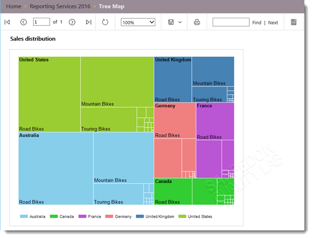
Besides this, there are two new types of diagrams: “Tree Map” and “Sunburst.” With the former, numbers can be put in relation easily and according to Hichert rules. It should also be much more easy to implement “Heat Maps” with it. Prior to this, one had to make do with spatial data and the corresponding map diagrams. This is what a Tree Map that illustrates sales per country, and placed in categories, can look like:
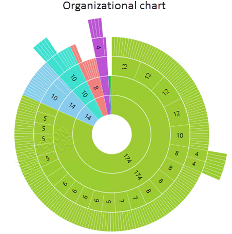
Next follows an example of a „Sunburst“-diagram with which especially beautiful psychedelic effects can be achieved. It is said that visualizations may have a great influence on decisions. With a little knowhow this could surely be enhanced… 😉
Just kidding…
Its application is suitable for hierarchies, and, in particular, also for „ragged“ hierarchies. Below, a standard example of a ragged hierarchy is illustrated with a sunburst-diagram:
Well, that is about all there is on innovations.
One more thing: Report elements such as diagrams, speedometers, maps or images can now also be integrated in Power BI Dashboards.
In closing, here are a couple of links for further reference:
-
- Pin Reporting Services charts to Power BI dashboards with SQL Server 2016 CTP 3.0
- Heat Maps as Reports
- Heat Maps for SSRS using Map Control
- Tree Map and Sunburst Charts in Reporting Services
- Customize the Parameters Pane
- How to create a custom brand package for Reporting Services with SQL Server 2016
- SQL Server Reporting Services Team Blog
Happy Reporting – finally 🙂
Andreas


Leave a Reply
Want to join the discussion?Feel free to contribute!